Gesucht wurde INTERIORS TO BEING, Medienart , Sortierung DatensatzNr., aufsteigend.
Kein exaktes Ergebnis. Alternative Fundstellen: 94 Treffer
AAP Archive Artist Publications - Munich - www.artistbooks.de
 
Verfasser
Titel
Ort Land
Verlag Jahr
Medium
Technische
Angaben
ZusatzInfos
Weitere
Personen
Sponsoren
Stichwort / Schlagwort
WEB Link
Geschenk von
TitelNummer
|
 
Verfasser
Titel
Ort Land
Verlag Jahr
Medium
Technische
Angaben
ZusatzInfos
Weitere
Personen
Sponsoren
Stichwort / Schlagwort
WEB Link
Geschenk von
TitelNummer
|
 
Verfasser
Titel
Ort Land
Verlag Jahr
Medium
Technische
Angaben
ZusatzInfos
Weitere
Personen
Sponsoren
Stichwort / Schlagwort
WEB Link
Geschenk von
TitelNummer
|
Verfasser
Titel
Ort Land
Verlag Jahr
Medium
Technische
Angaben
ZusatzInfos
Weitere
Personen
Sponsoren
Stichwort / Schlagwort
WEB Link
Geschenk von
TitelNummer
|
Verfasser
Titel
Ort Land
Verlag Jahr
Medium
Technische
Angaben
ZusatzInfos
Weitere
Personen
Sponsoren
Stichwort / Schlagwort
WEB Link
Geschenk von
TitelNummer
|
 
Verfasser
Titel
Verlag Jahr
Medium
Technische
Angaben
ZusatzInfos
Stichwort / Schlagwort
WEB Link
Geschenk von
TitelNummer
|
Verfasser
Titel
Ort Land
Verlag Jahr
Medium
Technische
Angaben
ZusatzInfos
Sprache
Stichwort / Schlagwort
TitelNummer
|
Verfasser
Titel
Ort Land
Verlag Jahr
Medium
Technische
Angaben
ZusatzInfos
Weitere
Personen
Sprache
Stichwort / Schlagwort
Geschenk von
TitelNummer
|
Verfasser
Titel
Ort Land
Verlag Jahr
Medium
Technische
Angaben
ZusatzInfos
Weitere
Personen
Sprache
Stichwort / Schlagwort
Geschenk von
TitelNummer
|
 
Verfasser
Titel
Ort Land
Verlag Jahr
Medium
Technische
Angaben
Sprache
Stichwort / Schlagwort
WEB Link
TitelNummer
|
Verfasser
Titel
Verlag Jahr
Medium
Technische
Angaben
ZusatzInfos
Sprache
Stichwort / Schlagwort
WEB Link
Geschenk von
Erworben bei Librería Dadá
TitelNummer
|
Verfasser
Titel
Ort Land
Verlag Jahr
Medium
Technische
Angaben
ZusatzInfos
Stichwort / Schlagwort
WEB Link
Erworben bei Hans Rudolf Zeller
TitelNummer
|
 
Verfasser
Titel
Ort Land
Verlag Jahr
Medium
Technische
Angaben
ZusatzInfos
Weitere
Personen
Sprache
Stichwort / Schlagwort
TitelNummer
|
Verfasser
Titel
Verlag Jahr
Medium
Technische
Angaben
ZusatzInfos
Sprache
Stichwort / Schlagwort
WEB Link
Erworben bei múltiplos
TitelNummer
|
Verfasser
Titel
Ort Land
Verlag Jahr
Technische
Angaben
ZusatzInfos
Weitere
Personen
Geschenk von
TitelNummer
|
Verfasser
Titel
Ort Land
Medium
Technische
Angaben
ZusatzInfos
Sprache
Stichwort / Schlagwort
Geschenk von
TitelNummer
|
Verfasser
Titel
Ort Land
Medium
Technische
Angaben
ZusatzInfos
Weitere
Personen
Sprache
Stichwort / Schlagwort
Geschenk von
TitelNummer
|
Verfasser
Titel
Ort Land
Verlag Jahr
Medium
Technische
Angaben
ZusatzInfos
Weitere
Personen
Sprache
Stichwort / Schlagwort
TitelNummer
|
Verfasser
Titel
Ort Land
Verlag Jahr
Medium
Technische
Angaben
ZusatzInfos
Weitere
Personen
Sprache
Stichwort / Schlagwort
Geschenk von
TitelNummer
|
Verfasser
Titel
Ort Land
Verlag Jahr
Medium
Technische
Angaben
TitelNummer
|
Verfasser
Titel
Ort Land
Medium
Technische
Angaben
ZusatzInfos
WEB Link
TitelNummer
|
 
Titel
Ort Land
Verlag Jahr
Medium
Technische
Angaben
WEB Link
TitelNummer
|
Verfasser
Titel
Verlag Jahr
Medium
Technische
Angaben
ZusatzInfos
Sprache
TitelNummer
|
Verfasser
Titel
Medium
Technische
Angaben
ZusatzInfos
Erworben bei Aaron Fabian
TitelNummer
|
Verfasser
Titel
Ort Land
Verlag Jahr
Medium
Technische
Angaben
ZusatzInfos
Weitere
Personen
Sprache
Stichwort / Schlagwort
WEB Link
Erworben bei 032c
TitelNummer
|
Verfasser
Titel
Ort Land
Medium
Technische
Angaben
Stichwort / Schlagwort
TitelNummer
|
Verfasser
Titel
Ort Land
Verlag Jahr
Medium
Technische
Angaben
Stichwort / Schlagwort
TitelNummer
|
Verfasser
Titel
Ort Land
Verlag Jahr
Medium
Technische
Angaben
ZusatzInfos
Stichwort / Schlagwort
WEB Link
TitelNummer
|
Verfasser
Titel
Medium
Technische
Angaben
Sprache
Stichwort / Schlagwort
TitelNummer
|
Verfasser
Titel
Ort Land
Verlag Jahr
Medium
Technische
Angaben
ZusatzInfos
Weitere
Personen
Sprache
Stichwort / Schlagwort
WEB Link
TitelNummer
|
Verfasser
Titel
Verlag Jahr
Medium
Technische
Angaben
Stichwort / Schlagwort
TitelNummer
|
 
Verfasser
Titel
Ort Land
Verlag Jahr
Medium
Technische
Angaben
Sprache
Stichwort / Schlagwort
WEB Link
TitelNummer
|
Verfasser
Titel
Verlag Jahr
Medium
Technische
Angaben
ZusatzInfos
WEB Link
Erworben bei Librería Dadá
TitelNummer
|
Verfasser
Titel
Ort Land
Verlag Jahr
Medium
Technische
Angaben
ZusatzInfos
Stichwort / Schlagwort
Geschenk von
TitelNummer
|
Verfasser
Titel
Ort Land
Medium
Technische
Angaben
ZusatzInfos
WEB Link
Geschenk von
TitelNummer
|
Verfasser
Titel
Verlag Jahr
Medium
Technische
Angaben
ZusatzInfos
WEB Link
TitelNummer
|
Verfasser
Titel
Ort Land
Verlag Jahr
Medium
Technische
Angaben
ZusatzInfos
Erworben bei Zédélé éditions
TitelNummer
|
Verfasser
Titel
Ort Land
Verlag Jahr
Medium
Technische
Angaben
ZusatzInfos
WEB Link
TitelNummer
|
 
Verfasser
Titel
Ort Land
Verlag Jahr
Medium
Technische
Angaben
ZusatzInfos
Geschenk von
TitelNummer
|
 
Verfasser
Titel
Ort Land
Verlag Jahr
Medium
Technische
Angaben
ZusatzInfos
TitelNummer
|
Verfasser
Titel
Ort Land
Verlag Jahr
Medium
Technische
Angaben
ZusatzInfos
WEB Link
Erworben bei Rens Chantal
TitelNummer
|
 
Verfasser
Titel
Ort Land
Verlag Jahr
Medium
Technische
Angaben
ZusatzInfos
Erworben bei Verlag der Buchhandlung Walther König
TitelNummer
|
Verfasser
Titel
Medium
Technische
Angaben
ZusatzInfos
Sprache
WEB Link
TitelNummer
|
 
Verfasser
Titel
Ort Land
Verlag Jahr
Medium
Technische
Angaben
ZusatzInfos
Sprache
Stichwort / Schlagwort
TitelNummer
|
 
Verfasser
Titel
Ort Land
Verlag Jahr
Medium
Technische
Angaben
ZusatzInfos
WEB Link
Geschenk von
TitelNummer
|
 
Verfasser
Titel
Ort Land
Verlag Jahr
Medium
Technische
Angaben
ZusatzInfos
Sprache
Stichwort / Schlagwort
TitelNummer
|
Verfasser
Titel
Verlag Jahr
Medium
Technische
Angaben
ZusatzInfos
TitelNummer
|
Verfasser
Titel
Ort Land
Verlag Jahr
Medium
Technische
Angaben
ZusatzInfos
Weitere
Personen
Sprache
Stichwort / Schlagwort
WEB Link
Geschenk von
TitelNummer
|
Verfasser
Titel
Ort Land
Verlag Jahr
Medium
Technische
Angaben
ZusatzInfos
Sprache
Stichwort / Schlagwort
TitelNummer
|
Verfasser
Titel
Ort Land
Verlag Jahr
Medium
Technische
Angaben
ZusatzInfos
Sprache
Stichwort / Schlagwort
Geschenk von
TitelNummer
|
 
Verfasser
Titel
Medium
Technische
Angaben
ZusatzInfos
Stichwort / Schlagwort
WEB Link
TitelNummer
|
Verfasser
Titel
Ort Land
Verlag Jahr
Medium
Technische
Angaben
ZusatzInfos
Weitere
Personen
Sprache
Stichwort / Schlagwort
Geschenk von
TitelNummer
|
Verfasser
Titel
Ort Land
Medium
Technische
Angaben
ZusatzInfos
Weitere
Personen
Sprache
Stichwort / Schlagwort
Erworben bei artbooksonline
TitelNummer
|
Verfasser
Titel
Ort Land
Verlag Jahr
Medium
Technische
Angaben
ZusatzInfos
Weitere
Personen
Sprache
Stichwort / Schlagwort
Geschenk von
Erworben bei Hermann Feldhaus
TitelNummer
|
Verfasser
Titel
Ort Land
Verlag Jahr
Medium
Technische
Angaben
ZusatzInfos
Weitere
Personen
Sprache
Stichwort / Schlagwort
TitelNummer
|
Verfasser
Titel
Verlag Jahr
Medium
Technische
Angaben
Sprache
Geschenk von
TitelNummer
|
 
Verfasser
Titel
Ort Land
Verlag Jahr
Medium
Technische
Angaben
ZusatzInfos
Weitere
Personen
WEB Link
Geschenk von
TitelNummer
|
Verfasser
Titel
Ort Land
Verlag Jahr
Medium
Technische
Angaben
ZusatzInfos
Sprache
Stichwort / Schlagwort
TitelNummer
|
Verfasser
Titel
Ort Land
Verlag Jahr
Medium
Technische
Angaben
ZusatzInfos
Sprache
Stichwort / Schlagwort
Geschenk von
Erworben bei Melville Brand Design
TitelNummer
|
Verfasser
Titel
Ort Land
Verlag Jahr
Medium
Technische
Angaben
ZusatzInfos
Sprache
Stichwort / Schlagwort
WEB Link
Geschenk von
Erworben bei Melville Brand Design
TitelNummer
|
Verfasser
Titel
Ort Land
Verlag Jahr
Medium
Technische
Angaben
ZusatzInfos
Sprache
Stichwort / Schlagwort
WEB Link
Geschenk von
Erworben bei Melville Brand Design
TitelNummer
|
Verfasser
Titel
Ort Land
Verlag Jahr
Medium
Technische
Angaben
ZusatzInfos
Sprache
Stichwort / Schlagwort
WEB Link
Geschenk von
Erworben bei Melville Brand Design
TitelNummer
|
Verfasser
Titel
Ort Land
Verlag Jahr
Medium
Technische
Angaben
ZusatzInfos
Sprache
Stichwort / Schlagwort
WEB Link
Geschenk von
Erworben bei Melville Brand Design
TitelNummer
|
Verfasser
Titel
Ort Land
Verlag Jahr
Medium
Technische
Angaben
ZusatzInfos
Sprache
Stichwort / Schlagwort
Geschenk von
Erworben bei Melville Brand Design
TitelNummer
|
Verfasser
Titel
Ort Land
Verlag Jahr
Medium
Technische
Angaben
ZusatzInfos
Weitere
Personen
Sprache
Stichwort / Schlagwort
Geschenk von
TitelNummer
|
Verfasser
Titel
Ort Land
Medium
Technische
Angaben
ZusatzInfos
Weitere
Personen
Stichwort / Schlagwort
Geschenk von
TitelNummer
|
 
Verfasser
Titel
Verlag Jahr
Medium
Technische
Angaben
ZusatzInfos
Weitere
Personen
Sprache
Stichwort / Schlagwort
Erworben bei art book cologne
TitelNummer
|
Verfasser
Titel
Ort Land
Verlag Jahr
Medium
Technische
Angaben
ZusatzInfos
Weitere
Personen
Sprache
Stichwort / Schlagwort
Erworben bei Café Royal Books
TitelNummer
|
Verfasser
Titel
Ort Land
Verlag Jahr
Medium
Technische
Angaben
ZusatzInfos
Weitere
Personen
Sprache
Stichwort / Schlagwort
WEB Link
WEB Link
Geschenk von
TitelNummer
|
 
Verfasser
Titel
Ort Land
Verlag Jahr
Medium
Technische
Angaben
ZusatzInfos
Weitere
Personen
Sprache
WEB Link
Erworben bei Luca Hillen
TitelNummer
|
Verfasser
Titel
Ort Land
Verlag Jahr
Medium
Technische
Angaben
ZusatzInfos
Weitere
Personen
Geschenk von
TitelNummer
|
Verfasser
Titel
Ort Land
Verlag Jahr
Medium
Technische
Angaben
ZusatzInfos
Weitere
Personen
Sprache
Stichwort / Schlagwort
WEB Link
Geschenk von
TitelNummer
|
Verfasser
Titel
Ort Land
Verlag Jahr
Medium
Technische
Angaben
ZusatzInfos
Weitere
Personen
Sprache
Stichwort / Schlagwort
WEB Link
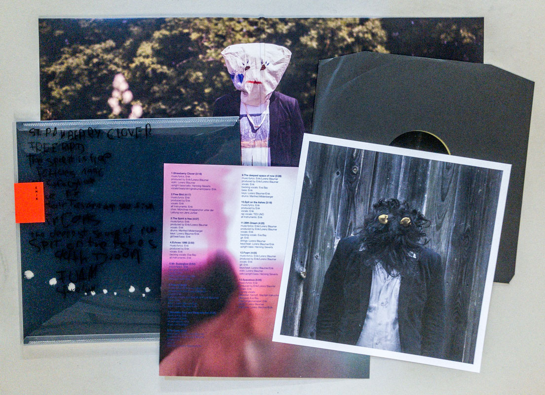
Erworben bei Enik
TitelNummer
|
Verfasser
Titel
Verlag Jahr
Medium
Technische
Angaben
ZusatzInfos
Weitere
Personen
Sprache
Stichwort / Schlagwort
WEB Link
Erworben bei múltiplos
TitelNummer
|
Verfasser
Titel
Medium
Technische
Angaben
ZusatzInfos
Sprache
Stichwort / Schlagwort
Erworben bei múltiplos
TitelNummer
|
Verfasser
Titel
Verlag Jahr
Medium
Technische
Angaben
ZusatzInfos
Weitere
Personen
Sprache
Stichwort / Schlagwort
WEB Link
WEB Link
Erworben bei múltiplos
TitelNummer
|
Verfasser
Titel
Ort Land
Medium
Technische
Angaben
ZusatzInfos
Sprache
Stichwort / Schlagwort
Erworben bei Steidl
TitelNummer
|
Verfasser
Titel
Ort Land
Verlag Jahr
Medium
Technische
Angaben
ZusatzInfos
Weitere
Personen
Stichwort / Schlagwort
WEB Link
Erworben bei Achim Riechers
TitelNummer
|
 
Verfasser
Titel
Ort Land
Verlag Jahr
Medium
Technische
Angaben
ZusatzInfos
Weitere
Personen
Stichwort / Schlagwort
Geschenk von
TitelNummer
|
Verfasser
Titel
Ort Land
Verlag Jahr
Medium
Technische
Angaben
ZusatzInfos
Stichwort / Schlagwort
WEB Link
Geschenk von
TitelNummer
|
Verfasser
Titel
Ort Land
Verlag Jahr
Medium
Technische
Angaben
ZusatzInfos
Sprache
Stichwort / Schlagwort
Erworben bei ABC-Culture
TitelNummer
|
Verfasser
Titel
Medium
Technische
Angaben
ZusatzInfos
Weitere
Personen
Stichwort / Schlagwort
WEB Link
Erworben bei Selfridges London
TitelNummer
|
Verfasser
Titel
Ort Land
Verlag Jahr
Medium
Technische
Angaben
ZusatzInfos
Weitere
Personen
Sprache
Stichwort / Schlagwort
TitelNummer
|
Verfasser
Titel
Ort Land
Verlag Jahr
Medium
Technische
Angaben
Stichwort / Schlagwort
TitelNummer
|
Verfasser
Titel
Ort Land
Verlag Jahr
Medium
Technische
Angaben
ZusatzInfos
Stichwort / Schlagwort
Erworben bei Saturn
TitelNummer
|
 
Verfasser
Titel
Ort Land
Verlag Jahr
Medium
Technische
Angaben
ZusatzInfos
Sprache
Stichwort / Schlagwort
WEB Link
WEB Link
WEB Link
Geschenk von
TitelNummer
|
 
Verfasser
Titel
Ort Land
Verlag Jahr
Medium
Technische
Angaben
Weitere
Personen
Sprache
Stichwort / Schlagwort
Geschenk von
TitelNummer
|
Verfasser
Titel
Ort Land
Verlag Jahr
Medium
Technische
Angaben
ZusatzInfos
Weitere
Personen
Stichwort / Schlagwort
Geschenk von
TitelNummer
|
Verfasser
Titel
Ort Land
Verlag Jahr
Medium
Technische
Angaben
ZusatzInfos
Sprache
Stichwort / Schlagwort
Geschenk von
TitelNummer
|
Verfasser
Titel
Ort Land
Verlag Jahr
Medium
Technische
Angaben
ZusatzInfos
Weitere
Personen
Sprache
Stichwort / Schlagwort
Geschenk von
TitelNummer
|
Verfasser
Titel
Ort Land
Verlag Jahr
Medium
Technische
Angaben
ZusatzInfos
Weitere
Personen
Sprache
Erworben bei art book cologne
TitelNummer
|
Verfasser
Titel
Ort Land
Verlag Jahr
Medium
Technische
Angaben
ZusatzInfos
Sprache
Stichwort / Schlagwort
Geschenk von
TitelNummer
|
 
Verfasser
Titel
Ort Land
Verlag Jahr
Medium
Technische
Angaben
ZusatzInfos
Weitere
Personen
Sprache
Stichwort / Schlagwort
Geschenk von
Erworben bei Vienna Art Book Fair #1
TitelNummer
|
 
Verfasser
Titel
Ort Land
Verlag Jahr
Medium
Technische
Angaben
ZusatzInfos
Sprache
WEB Link
Erworben bei Printed Matter
TitelNummer
|
Copyrighthinweis: Das Copyright für die abgebildeten Publikationen bleibt bei den jeweiligen Rechteinhabern (Künstlern, Fotografen, Gestaltern, Publizisten). Die Abbildungen und Textzitate dienen der künstlerischen und wissenschaftlichen Recherche. Hier werden Werke dokumentiert, die sonst nur schwer oder gar nicht zugänglich wären. Wer nicht damit einverstanden ist, dass sein Werk auf dieser Webseite gezeigt wird, kann die Abbildung umgehend durch mich löschen lassen. Für wissenschaftliche Recherchen können die großen Abbildungen auf Antrag freigeschaltet werden.
Wenn Sie als Rechteinhaber möchten, dass Ihre Abbildungen bei Klick größer gezeigt werden (Höhe x Breite = ca. 800 x 1200 Px), dann melden Sie sich bitte bei mir:
Wenn Sie als Rechteinhaber möchten, dass Ihre Abbildungen bei Klick größer gezeigt werden (Höhe x Breite = ca. 800 x 1200 Px), dann melden Sie sich bitte bei mir: